
" height="12.034px" id="Af5cA1UWb" transform="translate(8.426 6.766)" width="11.37395111111111px"/><path d="M 0 0 L 3.652 0 L 3.652 11.748 L 0 11.748 Z" fill="rgb(255, 255, 255)" height="11.748012222222219px" id="MkLJJz3Dq" transform="translate(2.486 7.052)" width="3.6519999999999997px"/><path d="M 2.112 0 C 0.946 0 0 0.946 0 2.112 C 0 3.278 0.946 4.246 2.112 4.246 C 3.278 4.246 4.224 3.278 4.224 2.112 C 4.224 0.946 3.278 0 2.112 0 Z" fill="rgb(255, 255, 255)" height="4.2459999999999996px" id="aV_Qrj4vj" transform="translate(2.2 1.2)" width="4.223999999999987px"/></svg>)
" width="22.000019700488746px"><path d="M 0 22 L 0 0 L 22 0 L 22 22 Z" fill="transparent" height="22px" id="TAln88NdR" width="22px"/><path d="M 9.051 6.216 C 9.508 5.986 9.853 5.73 10.089 5.454 C 10.51 4.956 10.718 4.296 10.718 3.478 C 10.718 2.681 10.51 2.001 10.095 1.43 C 9.402 0.501 8.229 0.025 6.57 0 L 0 0 L 0 13.411 L 6.126 13.411 C 6.816 13.411 7.456 13.352 8.047 13.231 C 8.638 13.109 9.15 12.885 9.583 12.558 C 9.968 12.273 10.29 11.919 10.546 11.503 C 10.95 10.873 11.152 10.159 11.152 9.365 C 11.152 8.594 10.975 7.939 10.623 7.399 C 10.267 6.86 9.744 6.466 9.051 6.216 Z M 2.71 2.329 L 5.67 2.329 C 6.32 2.329 6.856 2.4 7.277 2.538 C 7.764 2.741 8.007 3.152 8.007 3.779 C 8.007 4.341 7.822 4.735 7.454 4.956 C 7.085 5.177 6.605 5.289 6.016 5.289 L 2.71 5.289 Z M 7.39 10.848 C 7.063 11.006 6.602 11.085 6.012 11.085 L 2.71 11.085 L 2.71 7.508 L 6.057 7.508 C 6.64 7.512 7.094 7.589 7.419 7.734 C 7.996 7.995 8.284 8.473 8.284 9.173 C 8.284 9.998 7.987 10.554 7.39 10.848 Z" fill="rgb(255, 255, 255)" height="13.411432202354009px" id="HFm9zyYtR" transform="translate(0 4.124)" width="11.152166666666682px"/><path d="M 5.826 0 L 0 0 L 0 1.669 L 5.826 1.669 Z" fill="rgb(255, 255, 255)" height="1.669384444444444px" id="ob69wwipo" transform="translate(14.059 4.75)" width="5.826333333333329px"/><path d="M 9.883 3.982 C 9.762 3.205 9.495 2.522 9.08 1.932 C 8.625 1.264 8.047 0.774 7.344 0.465 C 6.645 0.154 5.857 -0.001 4.979 0 C 3.507 0 2.31 0.461 1.385 1.375 C 0.462 2.292 0 3.611 0 5.33 C 0 7.163 0.51 8.487 1.536 9.3 C 2.558 10.114 3.738 10.52 5.077 10.52 C 6.698 10.52 7.959 10.037 8.86 9.074 C 9.436 8.467 9.762 7.868 9.833 7.281 L 7.149 7.281 C 6.994 7.571 6.814 7.798 6.607 7.963 C 6.233 8.266 5.747 8.417 5.15 8.417 C 4.582 8.417 4.101 8.292 3.699 8.043 C 3.036 7.644 2.69 6.946 2.646 5.952 L 9.971 5.952 C 9.982 5.095 9.954 4.436 9.883 3.982 Z M 2.712 4.239 C 2.808 3.595 3.042 3.083 3.413 2.705 C 3.784 2.328 4.31 2.138 4.982 2.137 C 5.602 2.137 6.121 2.314 6.543 2.67 C 6.959 3.029 7.195 3.551 7.243 4.239 Z" fill="rgb(255, 255, 255)" height="10.519602312513724px" id="OpqIGSaT2" transform="translate(12.027 7.356)" width="9.973242433032693px"/></g></svg>)
Duducto
Live Preview

Website Design
Industry:
Branding
Design System
Year:
2026


Project Description
Project Description
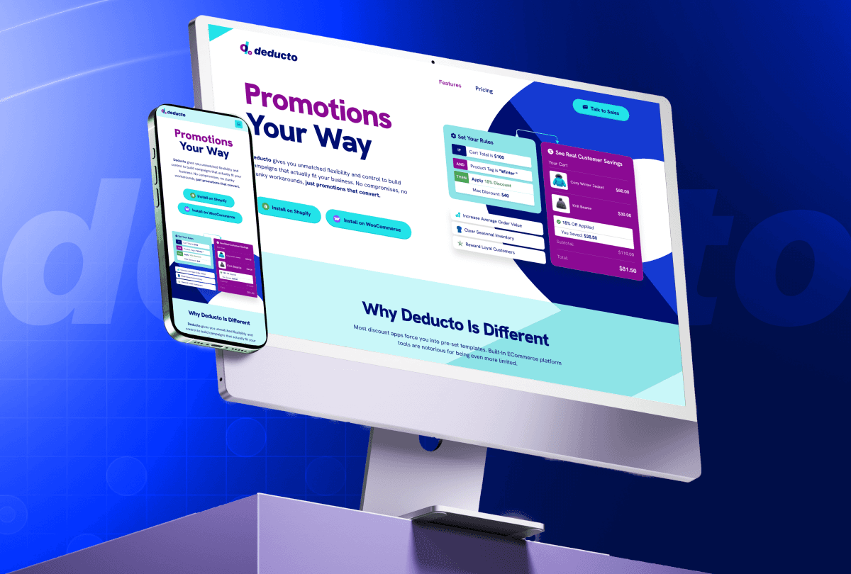
Deducto is a promotions engine built for e-commerce teams developers and marketers alike. It lets teams build custom discount logic, coupon campaigns, and stacking rules without writing custom code every time. The challenge was clear: how do you explain a technically rich product to two very different audiences a developer who wants to see the logic, and a marketer who wants to see the campaign and make both of them feel like this page was built for them?
Deducto is a promotions engine built for e-commerce teams developers and marketers alike. It lets teams build custom discount logic, coupon campaigns, and stacking rules without writing custom code every time. The challenge was clear: how do you explain a technically rich product to two very different audiences a developer who wants to see the logic, and a marketer who wants to see the campaign and make both of them feel like this page was built for them?
The challenge was to showcase a powerful payment solution that resonates with both business owners seeking growth and developers requiring secure, scalable integrations creating an experience that feels intuitive, reliable, and tailored to each audience.
The challenge was to showcase a powerful payment solution that resonates with both business owners seeking growth and developers requiring secure, scalable integrations creating an experience that feels intuitive, reliable, and tailored to each audience.

Problem
Problem
I spent time understanding where the current experience fell short. I identified 4 core problems clusters that were silently hurting conversions and trust.
Problem 1
Every feature was shown, but nothing was explained.
The page listed capabilities as flat bullet points. A visitor could see what Deducto could do, but never how it would actually behave in their store.
Problem 1
Every feature was shown, but nothing was explained.
The page listed capabilities as flat bullet points. A visitor could see what Deducto could do, but never how it would actually behave in their store.
Problem 2
It spoke to everyone and connected with no one.
Copy and visuals tried to serve developers and marketers with the same generic language, so neither audience saw themselves in it.
Problem 2
It spoke to everyone and connected with no one.
Copy and visuals tried to serve developers and marketers with the same generic language, so neither audience saw themselves in it.
Problem 3
Visitors understood the product but had no reason to act.
The value of the tool was described in the abstract ("flexible," "powerful") instead of shown in numbers a visitor could feel.
Problem 3
Visitors understood the product but had no reason to act.
The value of the tool was described in the abstract ("flexible," "powerful") instead of shown in numbers a visitor could feel.
Problem 4
The UI looked assembled, not designed.
Sections had been added feature-by-feature over time, with no shared type scale or color logic tying them into one product.
Problem 4
The UI looked assembled, not designed.
Sections had been added feature-by-feature over time, with no shared type scale or color logic tying them into one product.

Solution
Solution
Each problem got a specific, deliberate answer not just a redesign pass, but a change in what the page was actually doing.
Solution 1
Show the logic running, don't just describe it.
I replaced static feature bullets with a live rules-demo embedded in the page: a real cart total, a real product tag
Solution 1
Show the logic running, don't just describe it.
I replaced static feature bullets with a live rules-demo embedded in the page: a real cart total, a real product tag
Solution 2
Split the page into two parallel tracks instead of one blended message.
I structured the content around three distinct value lanes Flexible for Developers, Creative for Marketers, Powerful for Growth each with its own visual register.
Solution 2
Split the page into two parallel tracks instead of one blended message.
I structured the content around three distinct value lanes Flexible for Developers, Creative for Marketers, Powerful for Growth each with its own visual register.
Solution 3
Put a number next to every claim.
Instead of telling visitors the tool was powerful, I let the demo cart do the arguing: Subtotal $110.00 → $81.50 after a "Reward Loyal Customers" rule applies, sitting right beside the install CTA.
Solution 3
Put a number next to every claim.
Instead of telling visitors the tool was powerful, I let the demo cart do the arguing: Subtotal $110.00 → $81.50 after a "Reward Loyal Customers" rule applies, sitting right beside the install CTA.
Solution 4
Give the whole page one typographic and color system.
Every card, badge, and code block now runs on a single sans-serif type family (Hanken Grotesk) and one restrained, purposeful color palette.
Solution 4
Give the whole page one typographic and color system.
Every card, badge, and code block now runs on a single sans-serif type family (Hanken Grotesk) and one restrained, purposeful color palette.

Typography & Color System
Typography & Color System
Typography
Title
Syne
Syne
aa Bb
aa Bb
Body Text
Syne
aa Bb
aa Bb
Color System

Final Result
Final Result
A page where the logic engine demonstrates itself, developers and marketers each get a track built for them, real numbers sit next to every call-to-action, and every section from the hero to the pricing footer is governed by one design system rather than stitched together feature by feature.
Trusted By



Life behind the desk





" width="22.000083041373966px"><path d="M 0 22 L 0 0 L 22 0 L 22 22 Z" fill="transparent" height="22px" id="rJQlHEwpP" width="22px"/><path d="M 0 0 L 0 4.252 C 0 4.549 0.191 4.812 0.473 4.905 C 0.544 4.928 0.616 4.939 0.688 4.939 C 0.902 4.939 1.109 4.838 1.241 4.659 L 3.728 1.274 Z" fill="rgb(255, 255, 255)" height="4.938932307692308px" id="YarZzCSSw" transform="translate(8.021 16.145)" width="3.728086153846137px"/><path d="M 21.711 0.127 C 21.5 -0.022 21.224 -0.042 20.994 0.078 L 0.369 10.849 C 0.126 10.976 -0.018 11.237 0.002 11.511 C 0.023 11.786 0.205 12.02 0.465 12.109 L 6.199 14.069 L 18.409 3.628 L 8.96 15.012 L 18.57 18.297 C 18.641 18.321 18.717 18.333 18.792 18.333 C 18.916 18.333 19.04 18.299 19.149 18.233 C 19.323 18.127 19.442 17.948 19.472 17.748 L 21.993 0.789 C 22.03 0.533 21.922 0.278 21.711 0.127 Z" fill="rgb(255, 255, 255)" height="18.333446153846154px" id="aWDDnRa5x" width="22.000083041373966px"/></g></svg>)